That big logo at the top of the page hasn't changed for several years now. But in this blog's heyday (2009-2014, when we covered each episode of The Twilight Zone on its 50th birthday), said big logo changed fairly often--- at least once or twice per season, and then again for the summer reruns. But each time I changed it, those that came before just sorta evaporated into the ether. I've been meaning to archive them someplace here, mostly for posterity's sake (but also because some of 'em are pretty cool, if I do say so myself). So... what the hell, now's as good a time as any.
First up---- the early days. 2009-2010. The layout of the blog was different then... more basic, not to mention narrower. The logo is therefore not as wide (because, y'now, geometry or whatever). The very first attempt was clearly whipped up in under a minute.

It didn't last long, as I recall. I wanted Serling in there someplace. And, in a surprising (or not) shocking display of hubris, I put myself in the logo too (buy hey, it was MY blog, so why not?). And because I'm so goddamned cool, I used an obviously-staged sunglasses-adjusting pose.

I decided pretty quickly that that second version was kinda shitty. I didn't even bother to Photoshop out the edges of the picture elements, so the whole thing just comes off half-assed. So I went back to the digital drawing board and came up with something better, with three different versions, which I rotated in and out every so often. I used a different picture of myself in an attempt to minimize the douchiness.


As we neared the first season's end, I wanted the logo to reflect the new (and very short-lived) revised opening title design used on the show (the one with the giant eye, covered in agonizing detail here), so another revamping took place.

And then it was Summer 2010. I did some tweaking to the blog layout, which necessitated a wider logo. I created multiple versions and, to be perfectly honest, I don't remember if all of them were even used...


At some point during the summer of 2010 I bleached my hair (it was an aggressively reckless home-job which very possibly did some permanent damage to my scalp; I started balding very soon after). Naturally the logo needed to reflect my new Guy Fieri-wannabe look. This also marked the end of the "floating head" aesthetic... from here forward I'd be down in the left-hand corner, opposite Serling, with an actual upper body and everything.

And then it was Fall 2010, and it was time to start covering season two. In a (not-so) shocking demonstration of sheer laziness, I slapped a couple of season-specific graphics on the existing logo and called it good.

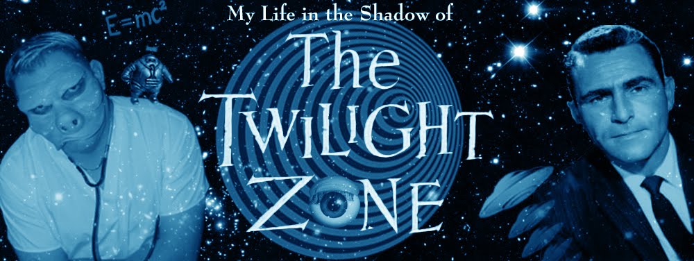
With my wife Teresa's help, I dressed up as Doctor Bernardi from "Eye of the Beholder" that year for Hallowe'en (go here for the scoop). A revision to the blog logo seemed appropriate... hell, it was absolutely necessary. I also added a season-specific identifier, which I'd do for the remainder of the five years.

Summer 2011 brought yet another new logo. While season two had just ended (well, fifty years earlier), the episodes aired during the Summer of '61 were from season one, so the new elements (the sun eyeball, Donlin and Corey from "I Shot an Arrow Into the Air," and the slot machine from "The Fever") were from season one episodes. Ever the chameleon, I changed the picture of me yet again (the bleach-job was almost gone; just the very tips were still blond). The "Now in... HD!" blurb was intended to denote that I was now pulling all my screen grabs from the Blu-rays (versus the lower-resolution DVDs; this upgrade was documented here). Oh, and I debuted a new shot of Serling too... also grabbed from the Blu-rays (I don't remember which episode, unfortunately).

.
I'll stop there for now. Tune in for Part 2... um, soon. Soonish.